Benchmarking 7 AI Dashboard Tools: Metric Hallucinations and Workflow Limits
A test of seven AI dashboard generators against a standardized sales brief reveals persistent metric calculation errors and limited export options across popular BI tools.
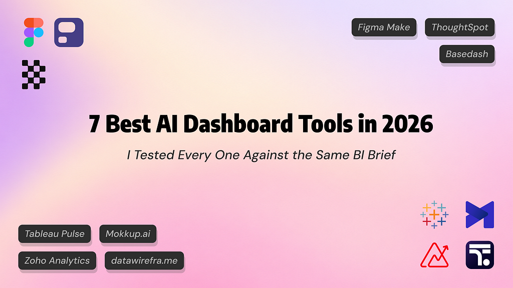
A comprehensive test evaluating seven AI-powered dashboard solutions against an identical sales brief and a 693-row dataset has revealed sharp disparities in analytical accuracy and workflow compatibility. The benchmark presented tools with standard business intelligence (BI) requirements across four regions alongside deliberately ambiguous requests, such as calculating customer conversion rates, active accounts, and average deal sizes without explicit formulas. The results demonstrated that while AI systems can rapidly generate functional visualizations, their underlying logic often defaults to flawed mathematical assumptions.
The Calculation Gap: Revenue Assumptions and Vague Metrics
When handed raw business data, several prominent platforms stumbled on fundamental calculations. In a scenario with 12 months of sales records, the actual closed-won revenue for the East region stood at approximately $1 million. However, Zoho Analytics, Tableau Agent, and ThoughtSpot’s Spotter agent all miscalculated this baseline by aggregating every deal in the file—including 378 lost entries—inflating East regional revenue to roughly $6.5 million.
Conversely, tools such as Mokkup.ai, Basedash, and Figma Make correctly isolated won deals, arriving at accurate baseline figures like $2.61 million in total won revenue. Transparency around ambiguous definitions varied widely. Basedash documented its logic beneath individual KPI tiles, noting won deals and recording an average deal size of $17,034. ThoughtSpot exposed its calculation plan via a "Show work" feature, which, despite delivering incorrect pipeline totals, allowed the user to identify where the query went wrong within 34 seconds.
Strikingly, only one tool—datawirefra.me—paused to request clarification on vague instructions before generating a design. When tasked with conversion metrics, it prompted the user to clarify whether conversion represented won deals over total pipeline, rather than guessing autonomously.
Platform Integrations and Export Bottlenecks
Beyond calculation fidelity, the evaluation highlighted deep operational divides between wireframing utilities, full-stack BI suites, and design tools. For teams reliant on traditional BI ecosystems, moving from an AI-generated interface to a production report remains a primary friction point.
- Mokkup.ai ($10 per user monthly for Pro) functioned as a dedicated BI wireframe generator, producing an exportable Power BI template (.pbit) populated with 18 DAX measures matching the underlying calculations.
- Basedash bypassed external BI suites entirely, connecting via Fivetran and Google Sheets to write SQL queries directly. It generated six interactive panels and regional drill-downs in 1 minute and 14 seconds, though its $1,000 monthly tier targets larger organizations.
- Tableau Cloud exposed functional fragmentation: Tableau Pulse cleanly tracked individually defined metrics like a $129.2K monthly revenue marker, but Tableau Agent declined the initial full-dashboard prompt entirely, stating dashboard creation was unsupported.
- Figma Make turned the prompt into an interactive React prototype within two minutes, correctly computing figures but inventing fictional elements, such as a company named "Northstar" and an unprompted manager profile.
- datawirefra.me operated without direct data connectivity, producing a multi-page wireframe with structured component identifiers and a Markdown build specification designed for manual handoff.
What it means for developers
For software engineers and data analysts building internal analytics pipelines, these findings underscore that natural-language dashboard generation cannot yet replace rigorous metric modeling. When LLMs interface directly with tabular data or database schemas, unconstrained prompts frequently produce silent aggregations—such as summing lost pipeline values into gross revenue—without alerting end users.
To prevent calculation errors, development teams must strictly decouple business logic from generative UI layers. Defining semantic layers, explicit DAX expressions, or parameterized SQL views prior to AI ingestion prevents models from making erroneous statistical assumptions. Wireframing tools that output clear build specifications or structured files (.pbit/.twbx) offer a more reliable bridge to production than end-to-end black-box generators.
For engineering teams experimenting with generative reporting workflows, testing how different foundation models parse analytical queries remains essential. Developers can try top AI models cheaply through one API at https://apixoai.online to evaluate how engines like Claude, GPT, and DeepSeek handle complex schema interpretation and prompt ambiguity before embedding them into client-facing data products. Ultimately, automated reporting tools only deliver value when teams independently audit the underlying calculations before deployment.
Source: 7 Best AI Dashboard Tools in 2026: I Tested Every One Against the Same BI Brief — Towards AI. Written by the Apixo team from that report.
One key for Claude, GPT, GLM, DeepSeek and more. Pay per token with crypto.
Get your API key